Monday 31 March 2014

EVALUATION QUESTION - IN WHAT WAYS DOES YOUR MEDIA PRODUCT USE, DEVELOP OR CHALLENGE FORMS AND CONVENTIONS OF REAL MEDIA PRODUCTS?


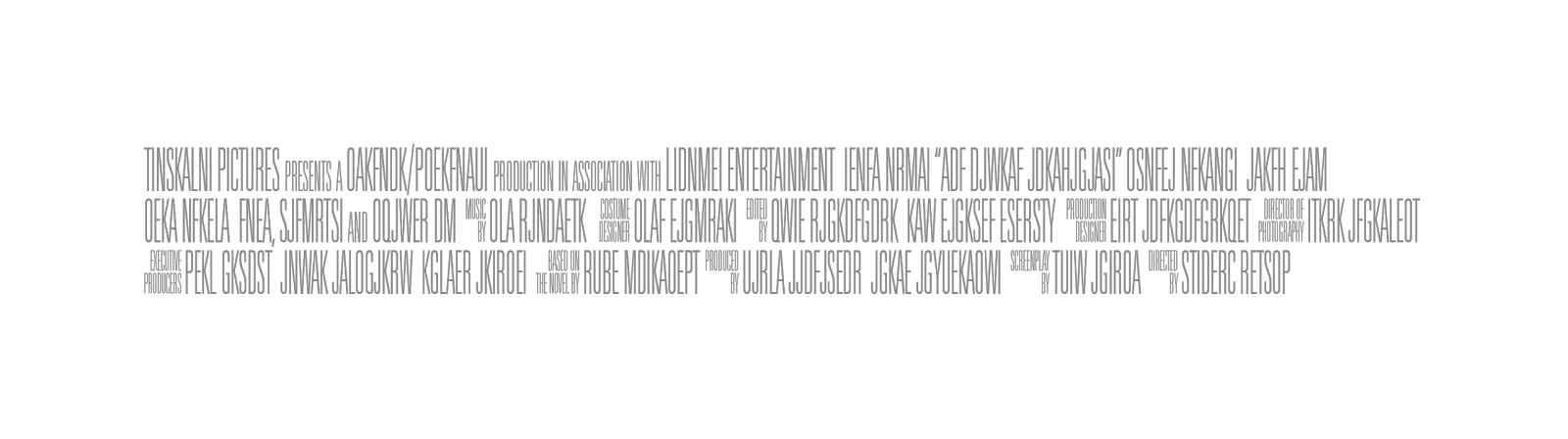
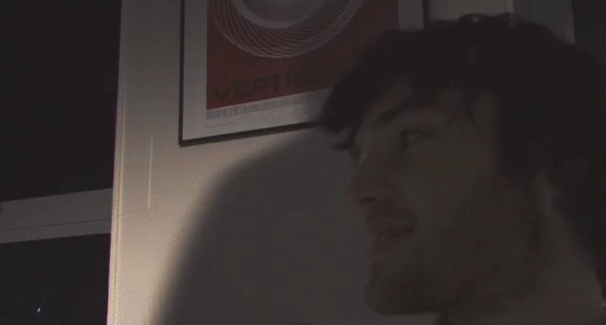
Describe the creative process of laying out the cover


I first created the template size for the magazine article (210x297) and placed the central main image on the magzine so I had something to design around. I pulled the image from the Youtube video of my film, and made it clearer by enhancing it with brightness and contrast settings. 


I then added the border around the picture, and also added a middle line to the article to give it a unique feel and make it stand out. 

After the border was done, I added the logo to the article. On the left hand side is the name of magazine 'Now Showing' which again is red and white to fit in with the rest of the colour scheme. The 'Twisted a Review' was placed on the right hand side of the page, and was also overlaid the main picture to give it the effect that it was just a cut and paste article. Also added was a small box, giving a quick general background of what the film is about. 

I then added another, smaller grab from the film and the star ratings. 


With that done, I added the review I had typed out before hand and centred it on the page. 


Finished article: 

Monday 24 March 2014

EVALUATION QUESTION - IN WHAT WAYS DOES YOUR MEDIA PRODUCT USE, DEVELOP OR CHALLENGE FORMS AND CONVENTIONS OF REAL MEDIA PRODUCTS?

Poster: How did you go about designing your poster? pt 2

I initially decided to use both characters for my film poster, but decided against this as I believe that it would give away the twist in the film, so, using the influence of the Dark Knight poster, I used the main 'villain for the film. 

First I cut out the face from the picture I wanted to use and deleted the background. I then applied the notepad filter to the picture, giving it the threshold effect. I replaced the colour with a red on that would fit the blood design and deleted the white part of the picture so it would appear somewhat transparent. 


With the main face done, I needed a background for my film. First I tried a plain white background, but with that looking a bit plain, I decided to use a white brick background found here: http://scenarhome.us/wp-content/uploads/2013/11/Painting-Brick-Walls-95.jpg This background was not too noticeable, but helped make the poster seem more unique, giving the blood splatter a graffiti type feel to it as well. 

With the central image and the background done, I wanted to add some additional images that would fit in the blood splatter theme, but not take away from the main picture. First I downloaded two separate images, one from:  http://www.dundjinni.com/forums/uploads/supercaptain/Blood_splatter_4-sc.png and the other from: http://www.dundjinni.com/forums/uploads/supercaptain/Blood_splatter_3-sc.png With the two high quality pictures downloaded I placed them on the poster to the side of the main image as this was the best place I decided they could be. I then changed the brightness and colour of the images to fit in with the main image so they would appear to be as one, rather stand out on its own. 


With the images all done,all I needed to add now was the text, first being the credits along the bottom of the poster. Instead of manually typing this out, I downloaded a template for it and added that to the bottom. (Downloaded from:  https://lh4.googleusercontent.com/-AqFcKvh0DHM/TdsweATIeII/AAAAAAAAAIw/hzrYuDOZ8kM/s1600/postercredits_3lines_left_tall.png

I then had to add the remaining text, the first being the name of the film. I downloaded a couple of different fonts from dafont.com  but couldn't find one I wanted, so I searched around the internet until I found the one I wanted. It was call 'youmurderedbb' and was downloaded from: http://www.fontspace.com/blambot/youmurderer-bb 


With the main font done, i needed to add the names to the poster. I decided against adding too many credit names along the top and placed them at the bottom instead. I used a movie poster style font downloaded from http://www.dafont.com/sf-movie-poster.font?text=sf+movie which for the directors name.  


Finished poster: 

Poster draft.

Even though my final poster has been created:
Here is anearlier edition of the poster which my final design was influenced by.


EVALUATION QUESTION - IN WHAT WAYS DOES YOUR MEDIA PRODUCT USE, DEVELOP OR CHALLENGE FORMS AND CONVENTIONS OF REAL MEDIA PRODUCTS?

Poster: How did you go about designing your poster?


Typically, posters for psychological films follow the same format, they use a dark background and feature the main actor in a similar gloomy expression. For my film poster I wanted to change this, but still keep it in line that it is a psychological thriller. 

I wanted to take two successful poster styles and merge them together for my own film. I used the styling of 'In the Land of Blood and Honey', with the blood splatter forming the image and used the message behind the poster for 'the Dark Knight', using the psycho 'bad guy' with a 'happy' expression, with combined with the blood shows his insanity. 

Both of these aren't psychological thrillers, but they both portray a message that I wanted to replicate in my film. 


Friday 21 March 2014

GIF from Short Film

null

MAGAZINE REVIEW PAGE


Tuesday 18 March 2014

Group Roles


Cinematographer - Jack Quinlan

Sound Editor - Jack Quinlan

Editor - Matt Healey

Director - Matt Healey, Jack Quinlan

Cast


Psychopath - Matt Healey

Henry - James Robinson

Mary - Jakiya Sultana

Unnamed Victim - Natasha Sizer

The Friend - Jack Quinlan

NEW PRODUCTION SCHEDULE


'Twisted' - A2 Short Film

Thursday 13 March 2014

Codes And Conventions Of Magazine Film Review Pages


The first thing to notice in Enpire's review of Avatar is the use of two pages. The review itself could fit onto just one page, but with dominating images being used, the feature prehaps the two pages. A big reason that this review uses big images despite having a small review is becase at the time, Avatar was a big blockbuster film and giving it a large selection of the magazine would have been done in most reviews.