I initially decided to use both characters for my film poster, but decided against this as I believe that it would give away the twist in the film, so, using the influence of the Dark Knight poster, I used the main 'villain for the film.
First I cut out the face from the picture I wanted to use and deleted the background. I then applied the notepad filter to the picture, giving it the threshold effect. I replaced the colour with a red on that would fit the blood design and deleted the white part of the picture so it would appear somewhat transparent.

With the main face done, I needed a background for my film. First I tried a plain white background, but with that looking a bit plain, I decided to use a white brick background found here: http://scenarhome.us/wp-content/uploads/2013/11/Painting-Brick-Walls-95.jpg This background was not too noticeable, but helped make the poster seem more unique, giving the blood splatter a graffiti type feel to it as well.

With the central image and the background done, I wanted to add some additional images that would fit in the blood splatter theme, but not take away from the main picture. First I downloaded two separate images, one from: http://www.dundjinni.com/forums/uploads/supercaptain/Blood_splatter_4-sc.png and the other from: http://www.dundjinni.com/forums/uploads/supercaptain/Blood_splatter_3-sc.png With the two high quality pictures downloaded I placed them on the poster to the side of the main image as this was the best place I decided they could be. I then changed the brightness and colour of the images to fit in with the main image so they would appear to be as one, rather stand out on its own.

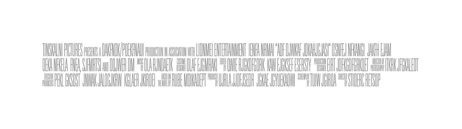
With the images all done,all I needed to add now was the text, first being the credits along the bottom of the poster. Instead of manually typing this out, I downloaded a template for it and added that to the bottom. (Downloaded from: https://lh4.googleusercontent.com/-AqFcKvh0DHM/TdsweATIeII/AAAAAAAAAIw/hzrYuDOZ8kM/s1600/postercredits_3lines_left_tall.png)

I then had to add the remaining text, the first being the name of the film. I downloaded a couple of different fonts from dafont.com but couldn't find one I wanted, so I searched around the internet until I found the one I wanted. It was call 'youmurderedbb' and was downloaded from: http://www.fontspace.com/blambot/youmurderer-bb

With the main font done, i needed to add the names to the poster. I decided against adding too many credit names along the top and placed them at the bottom instead. I used a movie poster style font downloaded from http://www.dafont.com/sf-movie-poster.font?text=sf+movie which for the directors name.

Finished poster:

No comments:
Post a Comment